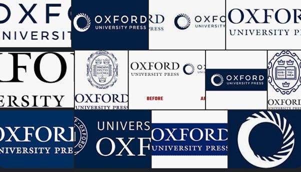
I was quite taken with Frederick Edward’s recent excoriation of Oxford University Press’s new logotype. In his article, Edward describes the logo as resembling a “flushing toilet.” He continued to examine the logo in terms of its bland conformity and explained that how in the modern world, standing out is frowned upon. Today, homogeneity is the thing. Hiding within sameness and monotony. I couldn’t agree more.
As the article pointed out, Oxford University Press is the second oldest university press in existence having been founded in 1586. Edward joked that there had been a range of responses to the logo, one saw the resemblance to a cake, whereas he saw a swirl of water transporting “one’s effluence” away. A fitting logo he argued, for an institution that appears “happy to flush its history, and hence its identity, down the loo.” It is difficult to disagree. The logo is bland, corporate, and rather empty epitomising the modern age. What sad times in which to live when the best modernity can do is a bland nothingness encapsulated within a sad little emblem of one of Britain’s most enduring institutions and a supposedly world class one at that.
In practice the logo we usually see on recent publications consists of a rectangular block design with the name “Oxford” emblazoned. However, it is when dealing with the company, its website and corporate identity, that the new logo takes pride of place. In my world where these logotypes are the wallpaper of my life, not only do many of this publisher’s books adorn many bookshelves in my home, but there was once a period in my life when I taught about logo design.
Given all of that, I was rather grateful to have this one pointed out to me. I confess that it has, to date, passed me by. As I wrote my comment below Frederick Edward’s article, I got the feeling that there was something more to think about here. So, with his permission, I want to run with this one a little further.
It occurred to me that the chance that the person designing said OUP logo could have been an Oxford graduate was a remote as anything that could be imagined in this world. It was more likely to have been a former polytechnic or art school trained person who put this together. And, with not much in the way of research, it can be revealed that British designer Rob Clarke was the talent behind the swirling circle.
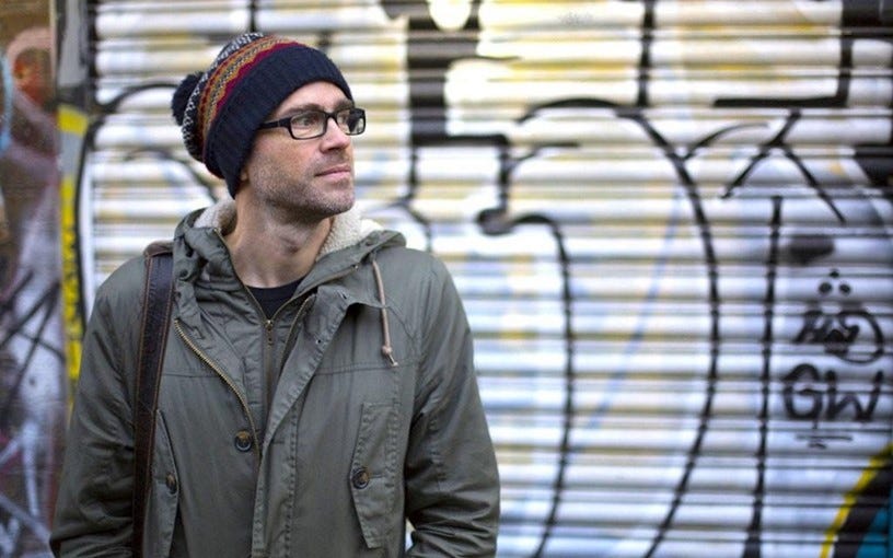
And yes, he was an art school graduate, Bournville since you ask, and then subsequently Nottingham Trent Polytechnic. Clarke presents himself as a bit of a Banksy-style street urchin, complete with beanie hat and background of graffitied walls or garage doors.
As it happens, the chances of you not encountering some of Rob Clark’s logotype work are quite small as he is a ubiquitous force in the design world. He has designed for Boots, Kleenex, Curry’s, Cadbury and Cornetto amongst many, many other brands. He is a big fan of a cheerful curved upswing in his typefaces. His work is playful in the main yet consistently recognisable. With a shimmer of sarcasm, I imagine that this ubiquity would count something towards the “REF” (Research Excellence Framework) in terms of “impact” had he been forced to remain within the institution of the “polytechnic,” (“new” university) but his independence makes this a matter for the real commercial world rather than the funding body fantasy world of universities such as Oxford.
The creative process that is involved in typeface and logotype design is often underestimated by the general population. Having looked a little closer into Clarke’s work and the interviews he’s given online, I find him to be professional and generous in the sharing of the details of his working process. There is a fluidity to his method where he uses drawing and mark-making to begin, which is then harnessed to digital platforms for further development. However, he does not just stab in the dark here. He has a brief to work to.
Before we can even consider the history of Oxford and its press, the modern world of typefaces-via-vector based software itself smooths over the history of typefaces. (By now some of you may be asking, “does this refer to fonts at all?” Yes, is the partial answer) The concept of a typeface begins with the old printing press and the faces of the metal letterforms that had to be arranged by hand and physically inked to form an impression. For the purpose of reading, serif typefaces such as Times New Roman are preferable. As for display, sans serif, Swiss type (or Helvetica) works better because it is easier to read. In a documentary on Helvetica, (2007) the concern over sameness and ubiquity was repeatedly highlighted. I would add further that the familiarity of “fonts” has diluted the specialist knowledge that a skilled designer can bring to a project. “Everyone” is a designer now you might argue. Yet there must be something to it all, otherwise why do big successful firms employ people like Rob Clarke if everyone can do it? He has something to impart this is true. However, complete independence is not quite it. As already mentioned, he always works to a client brief.
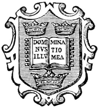
It is the client conversation as imagined between Oxford University Press and Clarke that intrigues me. What kind of values and ideas did they want him to convey with their new branding? And, pointedly, what did they want him to dispense with? I wonder how much of the history of Oxford as a University came into it. As Frederick Edward pointed out, the older emblem, more like a coat of arms, is replete with history and tradition. One Latin inscription translates as: The Lord is my Light. Another, as “The Truth frees us.” The references to learning, ecclesiastical authority, words and the importance of scholarship resonate. The idea that scholarship was wedded to the idea of truth is really instructive. (The reader may note the use of the past tense there) Seven seals are represented in a reference to biblical knowledge and prophecy. Somehow, I am not neglecting anything in assuming that none of these things would have been on the table as desirable attributes of the new logotype. Having been taught and guided in recent times by the type of scholar who is capable of publishing with Oxford University Press, I wondered if any of them would have given the new logotype a second thought. I’ll plump for a “no” on that one.
In order to imagine that creative briefing session, I tried to recall A level classes long gone now where we would deconstruct typical logo designs to learn about how they speak to the public. The typical square shaped concept always meant reliability, dependability and perhaps old-fashioned values. This was typical for a conservatively inclined building society for example. Any triangular shape was always thought of as dynamic and the circular logo was considered holistic, everlasting and inclusive. It could further be harnessed to signify progressive values, upbeat qualities. You could associate the circle with a wedding ring to demonstrate loyalty, a sense of permanence and commitment. If you tilted your circle, you infused it with a sense of dynamism, travel, movement forward. Think of the Vitruvian Man ensconced in the circle. With its associations with the sun, stars and moon, the circle was invariably going to have positive ramifications for any kind of project. In recent years when we no longer look towards the heavens, it is sufficient to consider the “planet” as our ultimate circular logotype. As you go about your business, notice how these ideas find themselves dotted around your world. We no longer look upwards, to the heavens. But downwards. The pagan gods of mother earth are the new deities.
In Clarke’s case, however, given his proclivity for typeface design, I guess that for Oxford University Press the simplicity of the letter “O” would be a fruitful starting point. But what about it? The logo has a number of variations, black or navy blue on white and reversed out. Both versions carry associations with steps, spiralling inwards, or even engravings on a ring. The other image I see is the idea of pillars devoid of any specificity and again the circular journey more inwards than out. Alice falling down a rabbit hole springs to mind, tumbling into dis-orientation, dis-orientalising. The logo turns ever inwards, never breaking out of the circle, if one could argue that the monotony of the circle is itself chiselled out by the rhythm of the design.
The striking specificity of the “O” conveys Oxford’s self-worth as an institution, confident in its future as an academic publisher par excellence. Its website with carefully calibrated woke values set out in little YouTube video presentations. My brief foray into this world yielded a glance at statements made about the importance of being “open” about one’s sexuality, yet presumably we do not bother if the person concerned is frightfully heteronormative.
However, there may be even more to the dominance of the letter “O” than I first thought. The Story of “O” by Pauline Réage which was first published in 1954 is an erotic novel based upon a series of sado-masochistic fantasies involving the complete sexual submission of “O.” The female character is only ever named “O” standing for nil, null, nothing, zero. The pictorial allusion to the ever-ready open mouth and genitalia further cements the image. In a post “me too” era, it is layered with problems and conundrums. Submissive fantasy as written by a woman, is that acceptable? Are portrayals of submissive women “allowed?” Yet recall how we are now proud to be open about (certain) sexualities at the Oxford University Press. What’s it to be?
The fusion of supreme confidence on one hand and total submission on the other is intriguing. Especially given the frequent repetition of phrases such as “net zero” and its feasibility or not in Britain (or anywhere for that matter). As I penned in a response on Frederick Edward’s comment section, it is the story of “O” for our times. Increasingly any mouth, open or otherwise, wishing to speak out against a narrative endorsed by the powerful funders of let’s say, Oxford University, given the huge sums supplied for injections in recent years, there are vested interests galore in keeping such mouths silent and submissive. The dangers in Reage’s (rather silly) fantasies pale into insignificance compared with the real harms done by both the university’s profitable injection development and its enjoining with the suppression of any dissent against a prevailing narrative it has helped to create. Consider by way of example, the erstwhile vilification of Professor Sunetra Gupta, herself an Oxford scientist, and hardly an “anti-vaxxer.” This is the way Oxford does “science” now, it makes things true by force of will, and not scientific debate and open discussion. What was that? The truth frees us? Not anymore.
However, this is the university’s press, the publishing arm of the university. The circular logotype carries numerous associations for us. Invariably, the circle will tend to cause recollection with what is known. (Hence Frederick Edward’s association with the toilet and I can but speculate that Sigmund Freud would have something to say on that one, but that’s for another day). When we encounter such a deliberate invocation of the circular motif, we are reminded of the everyday, the wheel, the world, the ball. Rotation, turning and movement, we are casting our chances on that most medieval of images, the wheel of fortune. With every turn of this medieval form of torture, it is not long before the assumed letterform of “O” morphs into its numerical doppelganger, the numerical value of zero.
Laurie Anderson (yes, her again) once sang amusingly about the binary system, that “nobody wanted to be a zero,” but that “everyone wanted to be number one.” It seemed funny back in the day. However, mathematical binary in an age where such code is the lingua franca of computerised screen culture, it is nevertheless lost on a generation that notwithstanding its obsession with “equality” struggles with the real meaning of the mathematical equals sign. Politically, binary and non-binary are the words of the day and with no hint of irony, binary code reduces everything to simple abstractions with little in the way of nuance.
And here, the zero, with all its connotations springs forth. Zero is null and void. It may surprise you to learn that zero is a concept fraught with danger. What, a little nothing, a null, a zero? What could be less harmful? In Charles Seife’s “Zero: The Biography of a Dangerous Idea,” (2000) the history of the concept of zero is outlined with wit and aplomb. Zero has not always existed as a concept in the history of humanity. Zero is mathematically speaking, infinity’s twin. He explains:
“They are equal and opposite, yin and yang. They are equally paradoxical and troubling. The biggest questions in science and religion are about nothingness and eternity, the void and the infinite, zero and infinity. The clashes over zero were the battles that shook the foundations of philosophy, of science, or mathematics, and of religion.”
“Underneath every revolution lay a zero and an infinity.”
And it is not necessary to read the book in order to get the danger at the heart of one of the most pressed ideas spinning around right now. Spin the wheel of fortune to arrive at:
Net zero.
Net zero is one of those abstract conceptual ideas which has been gaining traction through various government propaganda. One of the central ideas less often articulated is an underlying assumption that humanity is the cause of all the world’s ills, and that unchecked population growth is lies at the heart of the earth’s problems. This is the essence of what is frequently referred to as the Malthusian idea. This originated with Reverend Thomas Malthus’s flawed analysis of 1798, long since discredited, yet remerging under the guise of saving the planet. Malthus’s thesis argued that population growth was unsustainable because resources and food supplies were finite. There is a similar echo heard in the present day as assumptions (rarely tested, and, you know the drill, challenges simply not allowed) abound assume that population growth must be curbed. The Malthusian mindset is alive and well, and as Jordan Peterson has described, at heart, it is genocidal.
No matter that birth rates are dropping. No matter the observable dire consequences of China’s attempt at population control. The Malthusian wheel of fortune’s gain of traction refuses to consider evidence. And on the wheel turns, determined to righteously cull the useless eaters from the “planet.”
There is one book the Oxford University Press did not care to publish that contradicts completely the semi-murderous Malthusian outlook. Superabundance: The Story of Population Growth, Innovation, and Human Flourishing on an Infinitely Beautiful Planet. (Marian Tupy and Gale Pooley, Cato Institute, 2022). The authors show that it is population growth is the key to super abundance. More people and crucially, free people, generate more ideas and innovation and this is proven across time. Our story of “O”, and its current fads of censorship, ideological wokeism, planet worship, mandatory injections and silencing are unavoidably anti-human in their essence. They have their net zero ambitions yoked to net zero humanity.
Who can argue with the logical outcome of their goal which must be the end of humanity?
So. Back to that Oxford University Press logotype. How might that client brief go again?
OUP: “We’d like an image of open-mouthed total submission and simultaneous complete censorship. We’d like us to focus ever inwards, spiralling downwards with no human touch visible. We want to be open to sexualities but not normative ones. Natch, we want net zero at the heart of everything we do.”
Clarke: “You want to forego being number 1 in favour of zero?”
OUP: “Sublime Zero. Blissful “O” planet. “O” Superman. “O” Judge. End of humanity.”
Clarke: “O,” Ok guv. I’m onto it.”
(With grateful thanks to Frederick Edward)
(Apologies for the recent gap in service which is due to illness)


Sublime in wit; meritorious in argument; probing in argumentation; elevating in hopefulness; ridiculous in trajectory; poetic in presentation; emotive in manner; creative amidst banality.
I give it a 1.